

A new perspective on architectural branding.
An identity built around good design.
Isle Design Architecture wanted a professional, contemporary brand identity that reflected its approach to architecture, with an emphasis on quality, creativity and attention to detail. The challenge was to create something distinctive without being overly complicated. An identity that felt confident and established, while retaining the personal approach and individuality of the practice.
Our brief was to develop the brand from the ground up, exploring its positioning, messaging and visual direction before creating a recognisable logo, supporting identity and brand guidelines that could be used consistently across the business.
Four moves that shaped the brand.
We explored Isle Design Architecture's positioning, audience and competitors to understand what would help the practice stand out and establish a clear direction for the brand.
We developed initial ideas around typography, colour and architectural forms, looking for a balance between simplicity, personality and a professional appearance.
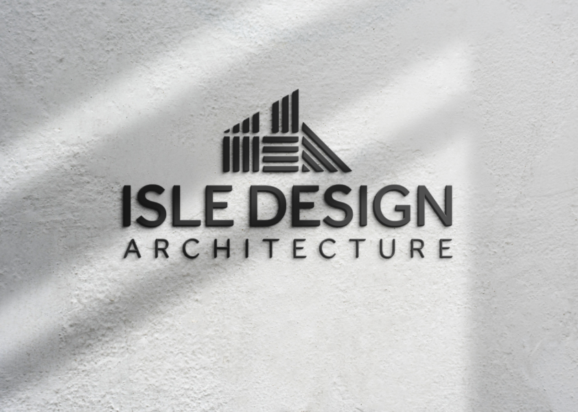
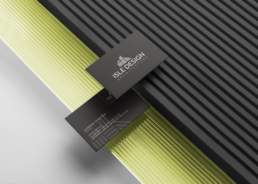
We refined the chosen direction into a distinctive logo, combining the IDA initials with a subtle architectural reference. A predominantly monochrome palette, supported by lime green and neutral accents, gave the identity a contemporary feel.
We brought the final identity together in a brand style guide, establishing how the logo, colours and typography should be used to maintain consistency across future applications.
Architecture at the heart of the identity.
The idea was to create a brand identity that reflected Isle Design Architecture's work without relying on the usual architectural clichés. At the centre of the design is a geometric icon that brings together the IDA initials with a subtle reference to the built environment. Clean typography and a predominantly monochrome palette keep the identity simple and confident, while lime green and softer neutral tones introduce a little personality.
The result is a contemporary identity that feels considered, recognisable and appropriate for an architectural practice, with the flexibility to work across a range of applications.
From identity to application.
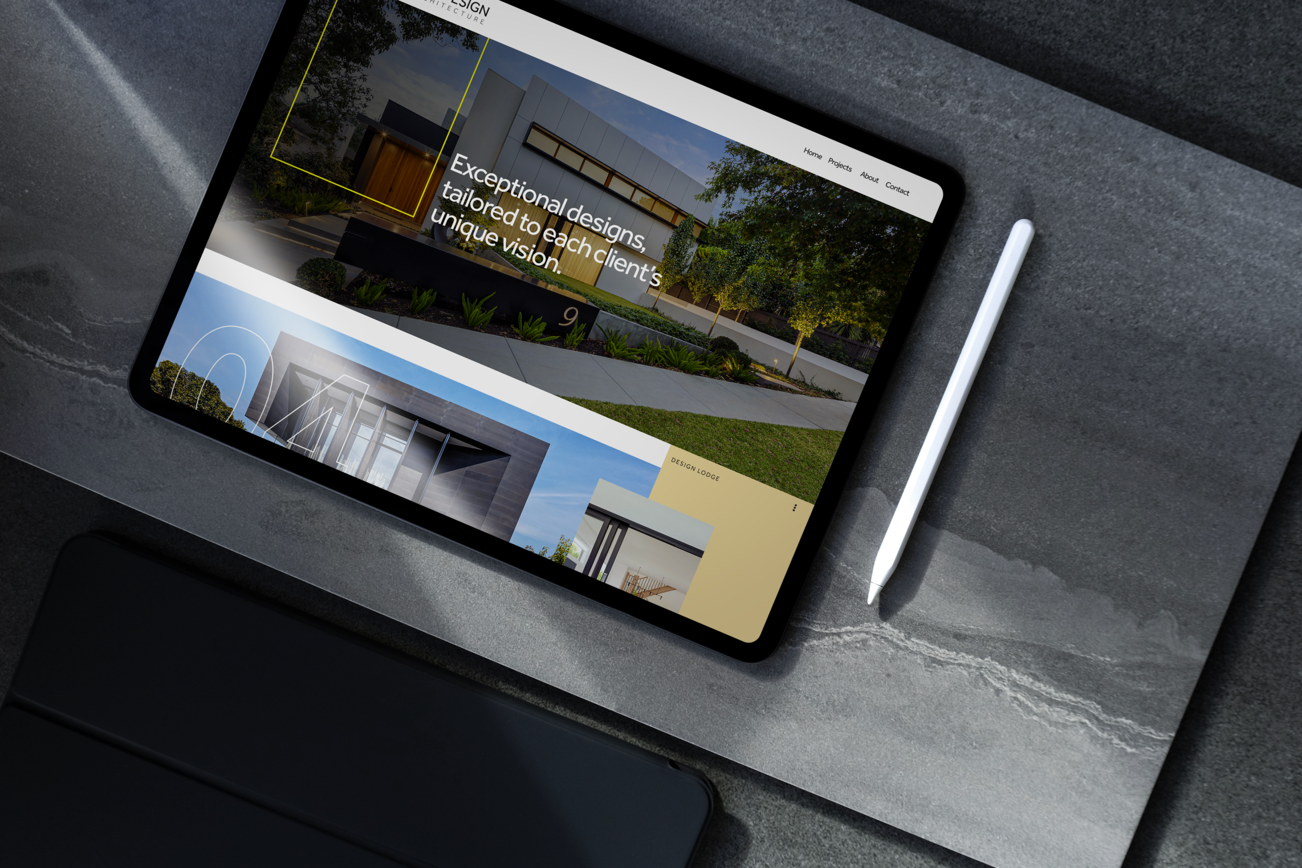
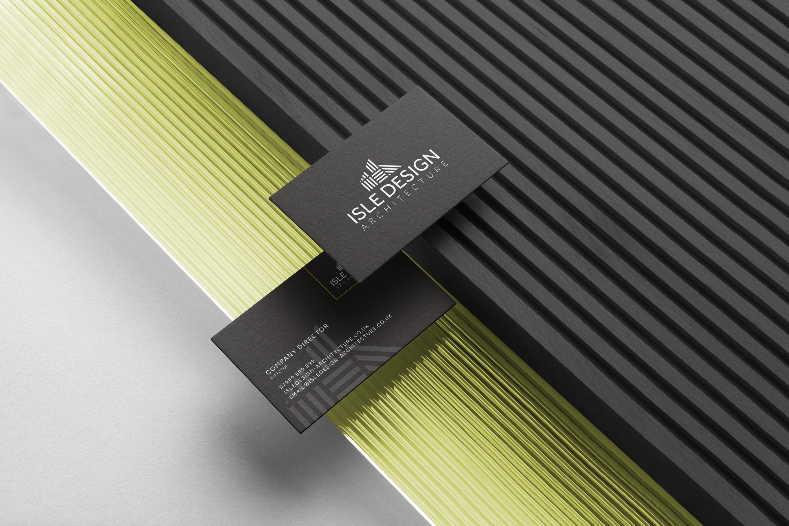
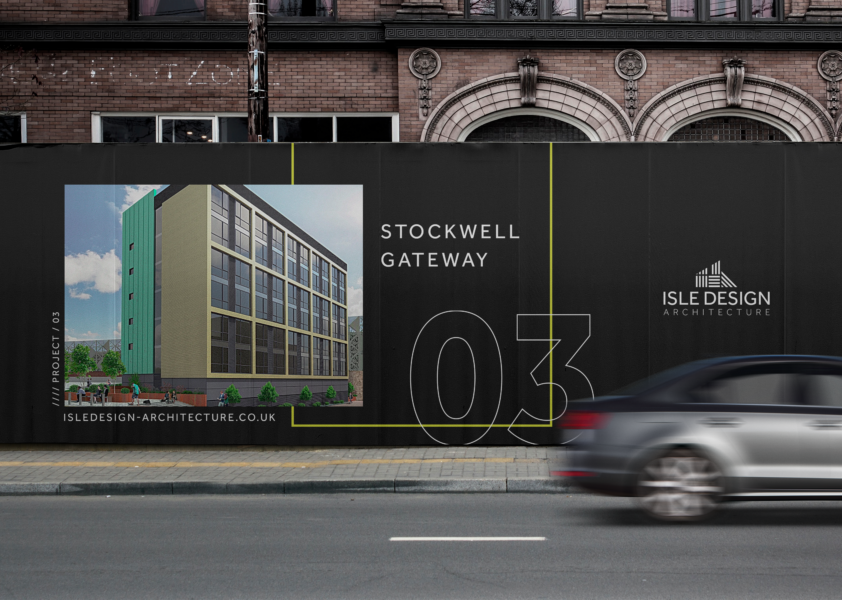
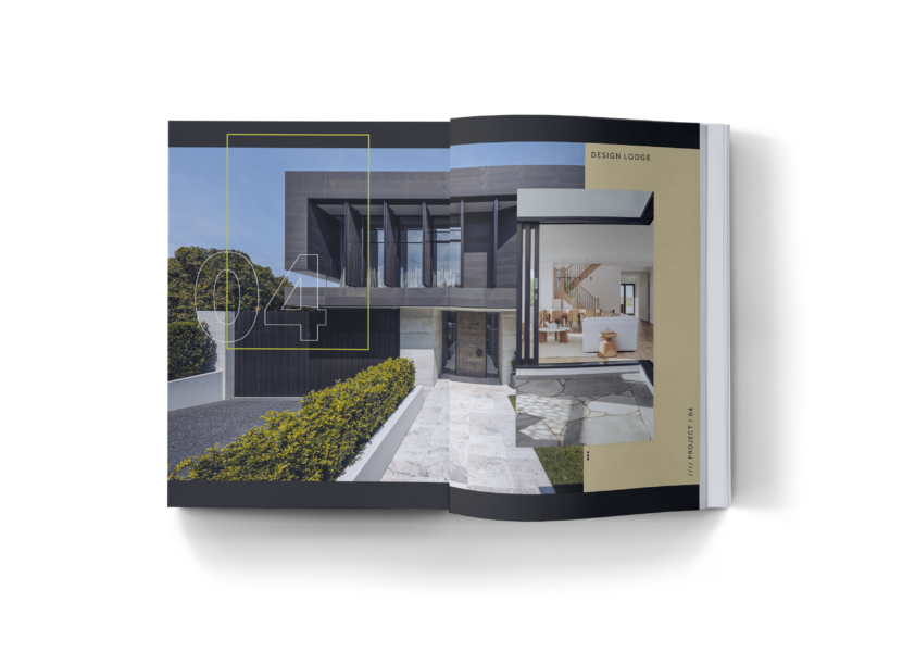
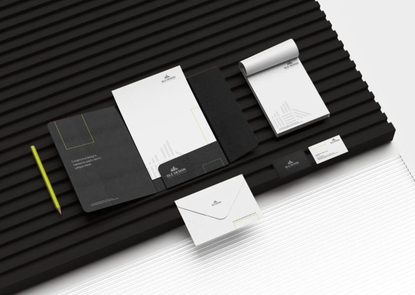
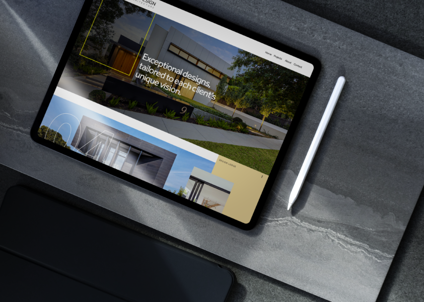
The finished identity brings together a distinctive architectural logo, clean typography and a carefully selected colour palette to give Isle Design Architecture a recognisable look. We developed a series of logo variations and supporting brand elements, alongside guidelines covering colour, typography and logo usage. The identity was also explored across a range of branded applications, demonstrating how the design could work beyond the logo itself while maintaining a consistent look and feel.
The elements behind the brand.
This project combined several of our specialist services. Explore them on our Brand page. There is more work like this on our branding page.
Thinking about your brand?
Whether you’re launching something new or your business has outgrown its current identity, we’ll help you create a brand that reflects who you are and where you’re heading.
Discuss your project Explore all projects