
A distinctive identity for a creative lighting design business.
A fresh identity for an established lighting design business.
Congo Design specialises in theatrical and entertainment lighting, working across live events, concerts and theatre. Having established its identity in 2015, the business was ready for a refresh. We began with a brand audit, reviewing its existing visual identity, website and communications to identify opportunities for improvement.
The findings highlighted the need for a more contemporary, consistent identity, supported by clear brand guidelines that could be applied across the business.
Four moves that shaped the brand.
We reviewed Congo Design's existing identity, website and communications, identifying opportunities to improve consistency, presentation and brand recognition.
The audit informed a refreshed visual direction, balancing a more contemporary identity with a clear connection to the business's specialist lighting expertise.
We developed a bold wordmark and distinctive icon combining the letters C and D, with a circular form inspired by the head of a spotlight.
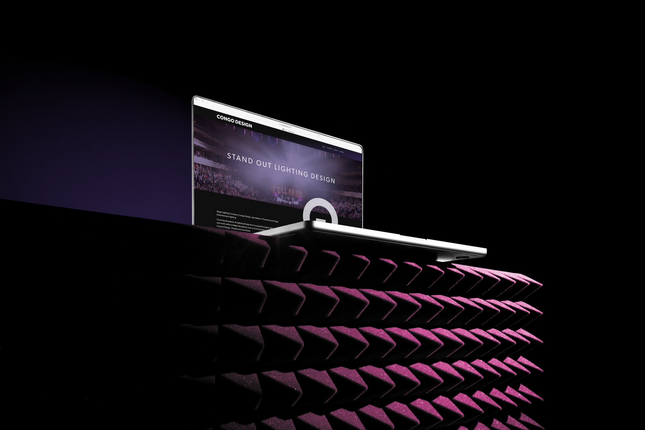
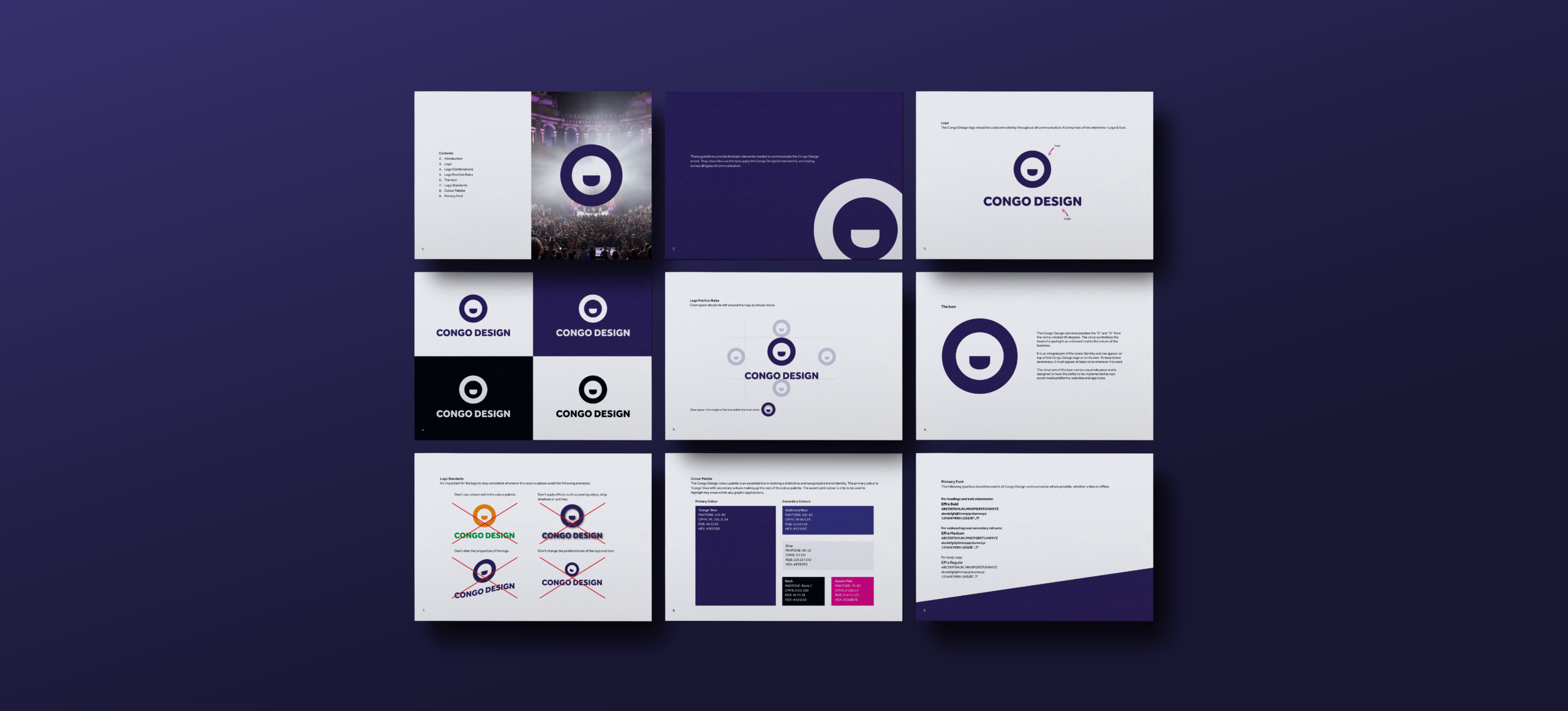
A refined colour palette, supporting typography and clear brand guidelines brought the identity together, with mock-ups demonstrating how it could work across different applications.
A spotlight on the brand.
The idea was to create an identity that felt distinctive while maintaining a clear connection to Congo Design's work in lighting.
At the centre of the rebrand is a bespoke icon combining the letters C and D, rotated to create a circular symbol inspired by the head of a spotlight.
Paired with a bold wordmark, a deep purple colour palette and a contrasting pink accent, the identity creates a recognisable visual style that can be applied consistently across the business.
From concept to application.
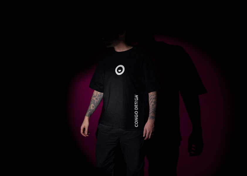
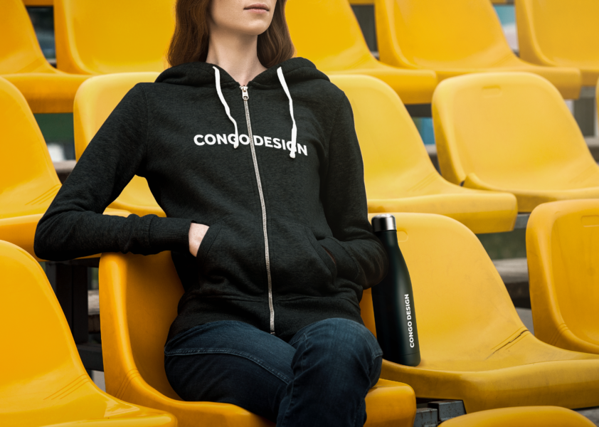
The finished identity brings together a bold wordmark, distinctive spotlight-inspired icon and a rich purple colour palette, with contrasting pink accents adding energy to the overall design. Supporting typography, flexible logo variations and clear brand guidelines establish a consistent visual style across different applications. From digital platforms to branded clothing and merchandise, the mock-ups demonstrate how Congo Design’s new identity can work across different touchpoints while remaining instantly recognisable.

The elements behind the brand.
This project combined several of our specialist services. Explore them on our Brand page. There is more work like this on our branding page.
Thinking about your brand?
Whether you’re launching something new or your business has outgrown its current identity, we’ll help you create a brand that reflects who you are and where you’re heading.
Discuss your project Explore more projects