

Bringing brand and workplace together.
A consistent identity, inside and out.
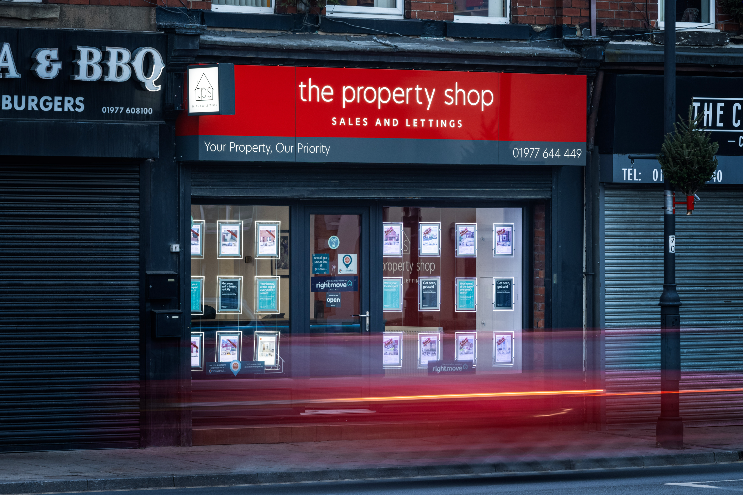
The Property Shop is an established, family-run estate agency offering residential sales and lettings services in West Yorkshire. The project brought together a refreshed brand identity, office interior design, photography and marketing collateral, creating a more consistent look and feel across the business.
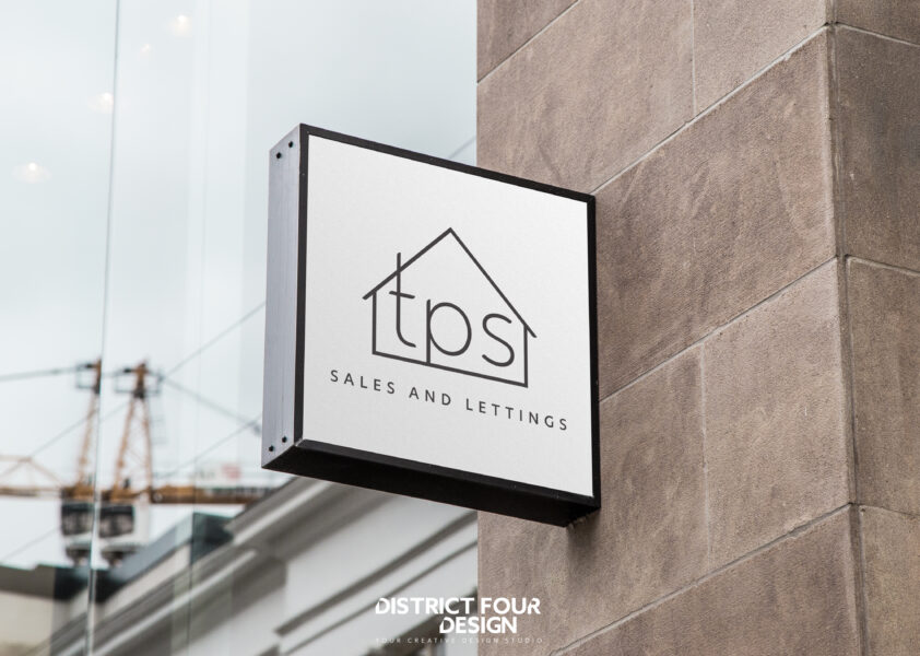
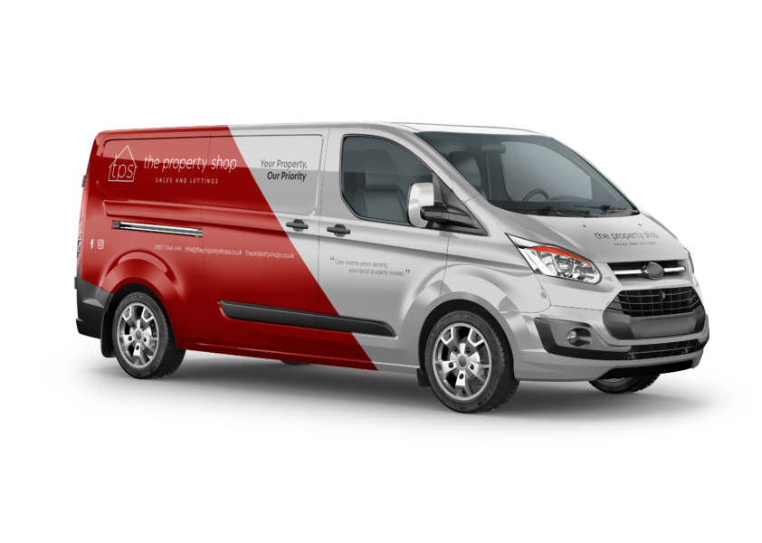
From the office environment and signage to printed brochures and vehicle graphics, the aim was to create a recognisable identity that reflected the company's professional yet approachable service.
Four moves that shaped the brand.
We looked at The Property Shop's existing identity and how the business could present itself more consistently across its office, marketing and customer communications.
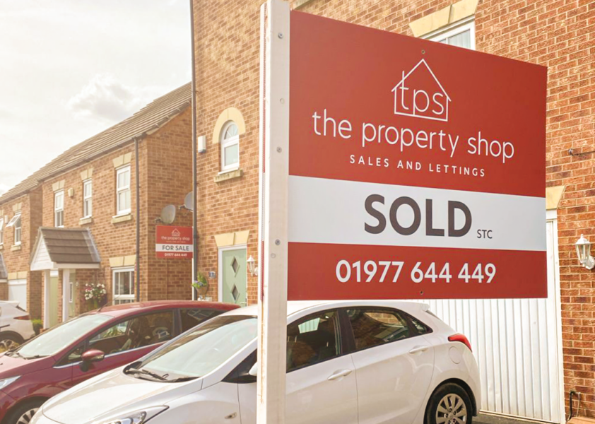
We developed a recognisable TPS icon incorporating a house outline, supported by a clean wordmark, red and charcoal colour palette and clear typography.
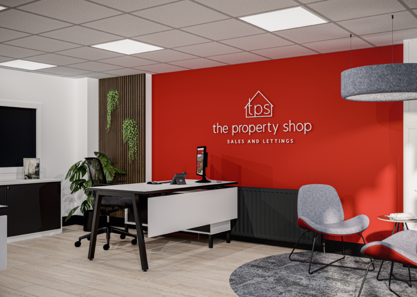
We carried the visual direction into the office interior design, considering how the workspace could reflect the identity and create a welcoming environment for clients.
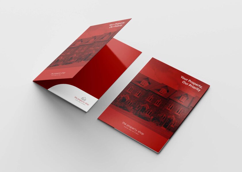
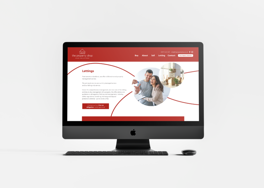
We extended the identity across photography, brochures, vehicle graphics and other marketing materials, creating a consistent visual approach across different touchpoints.
More than just a logo.
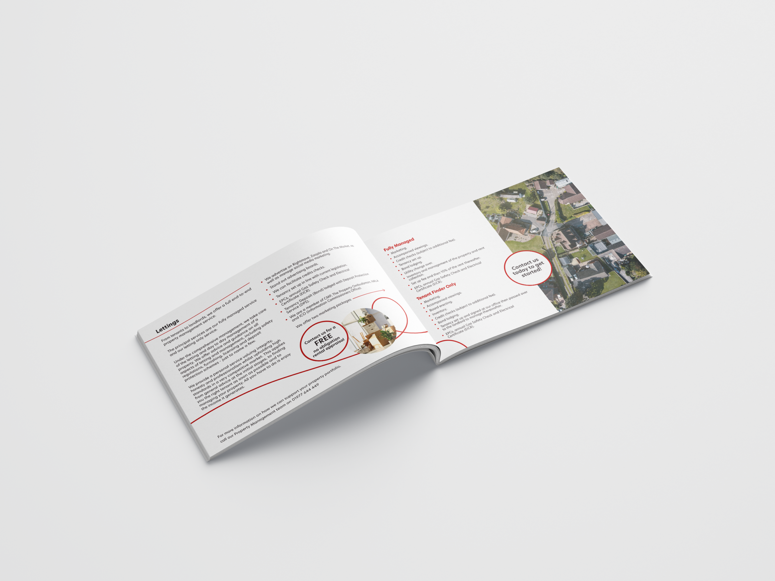
The idea was to create a recognisable identity that could extend beyond the logo and become part of the wider customer experience. A simple house-shaped TPS icon connects the brand directly to the property industry, while the red and charcoal palette creates a distinctive, consistent visual style.
By carrying the identity through the office interior design, photography, vehicle graphics and marketing collateral, we brought the different elements of the business together under one cohesive brand.
Bringing the brand to life.
The refreshed identity was developed to work across every aspect of The Property Shop’s business, from its office environment to its marketing materials. We created a distinctive visual style built around the TPS logo, a bold red and charcoal colour palette and clean typography. This was carried through into the office interior design, vehicle graphics and printed collateral, including a customer brochure. Alongside the design work, photography helped bring the brand together, creating a consistent and recognisable look across its different applications.
The elements behind the brand.
This project combined several of our specialist services. Explore them on our Brand page. There is more work like this on our workplace design and branding pages.
Thinking about your brand?
Whether you’re launching something new or your business has outgrown its current identity, we’ll help you create a brand that reflects who you are and where you’re heading.
Wondering what yours would cost? Get a rough price from our office cost estimator.
Discuss your project Explore more projects